Artwork

Concertina Sketchbook Project

Back in February, I began a 6 week course with Karen Stamper on developing a concertina sketchbook. It was a journey of discovery, stretching my comfort at many points along the way, as I became immersed in a process and flow that was new to me.

At first, we filled the pages with marks, using pencils, inks, charcoal, pens and more. I so enjoyed playing with the ink, particularly when blowing on wet ink to create meandering lines. In the process of adding collage elements, I felt like I was able to start making the pages my own, especially when adding the cut circles.

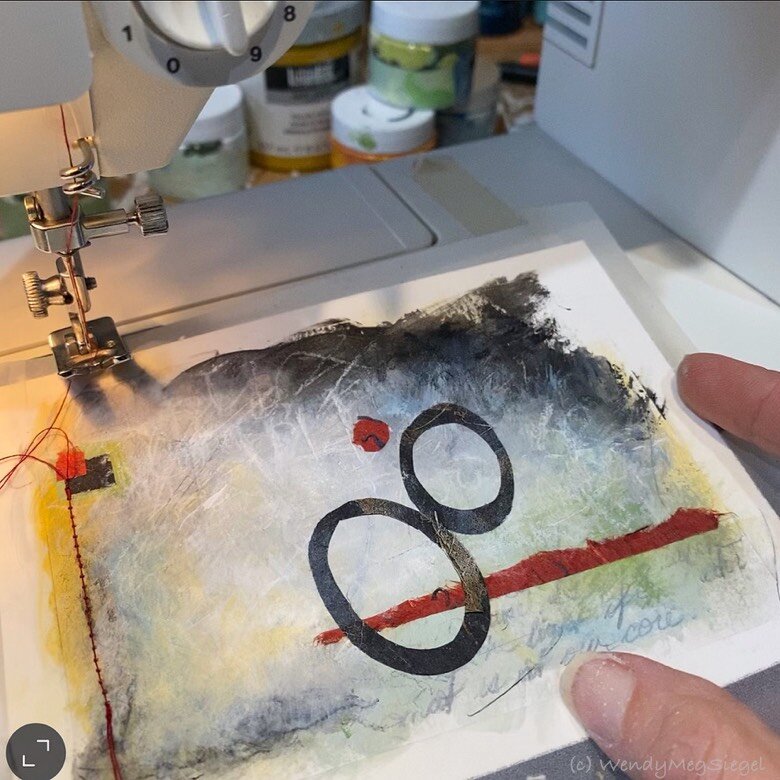
Just beginning to add color. Surrounded by materials on the large work table.

Just beginning to add color. Surrounded by materials on the large work table.

The studio has never been as messy as it was during that project. The table was covered with every mark making tool I own. The floor was covered with the vast array of papers and collage possibilities… photos, magazines, maps, dress patterns, sheet music pages, and bags of the art papers collected over the years. I even found the texture boards and alternative brushes I had made years ago for my daughter’s elementary school class. I used the one with feathers to drag wispy lines of ink across the pages.

Then it came time to paint the marked up pages. Yay!! But before I began to paint, I searched for hidden compositions with my handy dandy cropping tool... an old mat, cut at the corner.

Adding the finishing touches to the first pages.

Adding the finishing touches to the first pages.

Once I realized I had been treating these sketchbook pages as if they were too precious, I chose a section, took a deep breath, and I was able to enjoy adding paint. I let go of the preciousness and got comfortable developing areas, redoing others, and covering up full sections. Some pages became pretty busy with additional collage elements and paint, while others were left fairly simple.

Since completing the concertina sketchbook, I’ve been continuing to play with the images, processes, and ideas that took shape on those pages, in order to get more out of this experience before moving on. Although it feels as if I’ve been on an adventure, traveling far from my way of working, I’ve had the opportunity to grow and expand my choices in the future. As I prepare to explore the new work that’s now tugging on my sleeve, I’m curious to see how the concertina sketchbook will end up influence my creative flow moving forward.

Cropped images from the completed pages for future inspiration.

Cropped images from the completed pages for future inspiration.

You may also be interested in:
Re-Words Concertina
Concertina Sketchbooks

The 12 Painting Meditations

“Meditations No. 12” 4-1/2” x 6”. Mixed media on paper

“Meditations No. 12” 4-1/2” x 6”. Mixed media on paper

The painted Meditations were inspired by the peace and joy I experienced when working on the Morning Meditation Paintings. I wanted more of those feelings and I wasn’t ready for it to end. So, I decided to change it up a bit and create a series of twelve small paintings that would start out as a group… and continue within a meditation process.

“Meditations No. 3” 4-1/2” x 6”. Mixed media on paper

“Meditations No. 3” 4-1/2” x 6”. Mixed media on paper

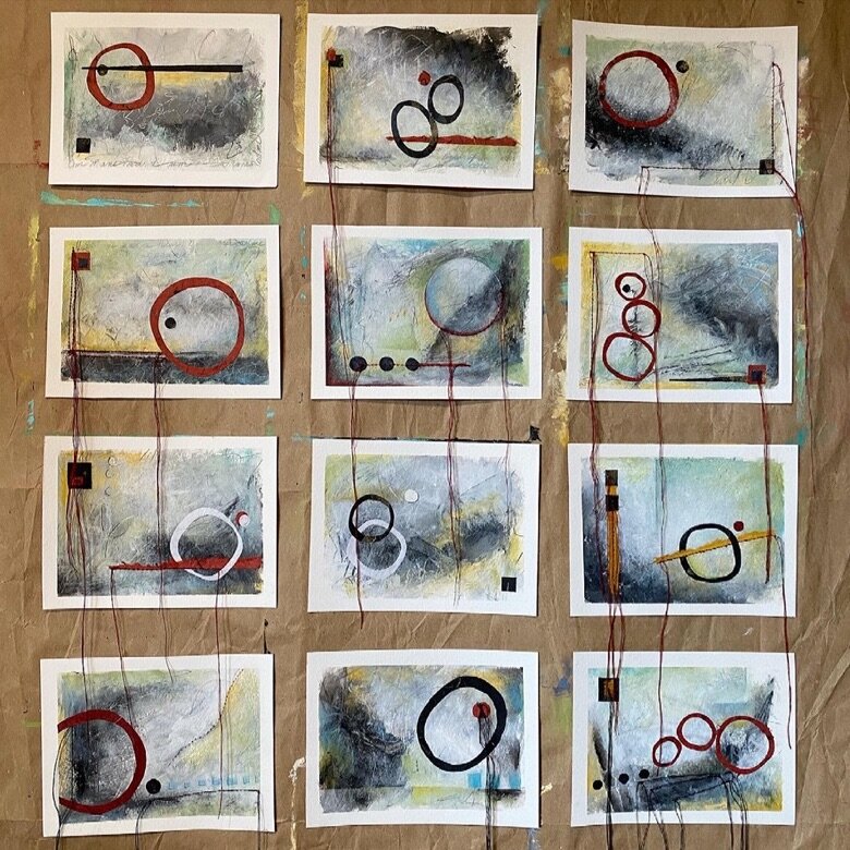
The Process: First, I hung twelve 4-1/2” x 6” pieces of watercolor paper together on the closet door in four rows of three. I began developing the collection by writing mantras and quotes on each in pencil, then scribbling on each with charcoal, a pencil, and then a pen and worked on them in order, from the top left and across, one row at a time. Next, I followed up with a bit of acrylics, using a very limited palette.

“Meditations No. 2” in process

“Meditations No. 2” in process

Working in the same order, I began completing one at a time as a morning meditation… adding bits of additional color, marks, and collage shapes. Stitching was added to most but not all, allowing the strands to hang down below the bottom of the paintings.

There were a number of times when I found it difficult to add the shapes and stitching to an individual piece. This was when I grew to love the background and didn’t want to cover it up. But in each of these cases, it turned out to be a more interesting image once the additions were made.

“Meditations No. 8” 4-1/2” x 6”. Mixed media on paper

“Meditations No. 8” 4-1/2” x 6”. Mixed media on paper

Working on the Meditation paintings has been an enjoyable process. It has provided me with the gifts of simplicity and peace at a time when the world outside of the studio seemed complex and stressful. (I began this series in mid January 2021.) There was a wonderful feeling of simplicity in choosing the same palette and collection of cut shapes for each of these pieces.

The 12 Meditations hanging in a group

The 12 Meditations hanging in a group

Now, they are likely to continue hanging together on the door for awhile. This series adds a sense of calm to the studio and makes me smile to see them.

You may also be interested in:
Morning Meditation Paintings
Art as Meditation


Morning Meditation Paintings

“Morning Meditation No. 1” 5-1/2” x 6”. Mixed media in sketchbook

“Morning Meditation No. 1” 5-1/2” x 6”. Mixed media in sketchbook

A couple of months ago I began a Morning Meditation painting practice. This quickly became my favorite way to start the day, as it filled me with a wonderful sense of peace and a lightness of being. Each session became a vehicle for tuning my awareness (aka mindfulness). This practice is now something I am continuing as a gift to myself.

“Morning Meditation No. 5” 5-1/2” x 6”. Mixed media in sketchbook

“Morning Meditation No. 5” 5-1/2” x 6”. Mixed media in sketchbook

The original focus was on simplicity and flow… working first thing in the morning, as a meditative process, mostly with background music, sometimes in silence. The process is the focus, not whether I liked the piece or not, not whether it feels finished or not.

THE PROCESS: Starting with a limited palette of acrylics (black, white, and a premixed blue-green). Adding some other bits of color and scribbles with pencil and colored pencil. Including collaged paper shapes because they happened to be scattered on the work table from prior sketchbook paintings. And… Since the sewing machine was on the nearby table, stitches were added to some of the paintings when it felt right, and because… why not?

“Morning Meditation No. 13” 6” x 8-1/4”. Mixed media on paper

“Morning Meditation No. 13” 6” x 8-1/4”. Mixed media on paper

I have so appreciated the quiet color palette on these pieces, especially after the fairly loud year we had in 2020 and the tumultuous beginning to 2021. I felt the need to tone things down for a bit, and the subtle touches of color add to the peaceful experience. It’s likely more color will be added as I continue to produce these pieces (or maybe not).

I have embraced the meditative painting process. In fact, just thinking of my morning experiences, gives me a wonderful feeling of Ahhhhh! I feel as though these painting meditations are carrying me forward towards the ME I am becoming. There seems to be an internal process taking place and a preparation at work. And… my love of the process has me fully committed and engaged.

“Morning Meditation No. 4” 5-1/2” x 6”. Mixed media in sketchbook

“Morning Meditation No. 4” 5-1/2” x 6”. Mixed media in sketchbook

“Morning Meditation No. 2” 5-1/2” x 6”. Mixed media in sketchbook

“Morning Meditation No. 2” 5-1/2” x 6”. Mixed media in sketchbook

You may also be interested in Love: a Morning Practice or Joy: a Morning Ritual.

A Process Story

“Ennobled” 12” x 12” acrylic, papers, pencil on canvas

“Ennobled” 12” x 12” acrylic, papers, pencil on canvas

The experience of working on “Ennobled,” the 5th canvas in the Portals of Joy series, was a bit like maneuvering a boulder up an incline. All the while, I was able to experience these challenges with confidence and determination. It became an excellent exercise in creating and recreating, making changes, letting go and moving on.

“Ennobled” in process; initial color palette

“Ennobled” in process; initial color palette

I began the painting with a color palette that I found attractive but, it just wasn’t quite me. Once on the canvas it seemed goofy, like a Halloween candy wrapper. So I kept altering colors, one at a time, and adding textured papers to cover up some of the colors and create new ones. I found the process enjoyable, without frustration. I was able to draw on my confidence that each alteration would bring me closer to feeling as if I had made it my own. What a time consuming process it was! If I hadn’t been as focused on the unfolding experience of the process, I would not have been able to remain in the joy of creating.

“Ennobled” in process; at the start

“Ennobled” in process; at the start

Occasionally, a painting doesn’t flow as smoothly. Each time I find myself in that space, I have the gift of letting go and immersing myself in the painting process. I allow it to take as long as it takes, with no expectations and the willingness to continue to apply layer over layer, repainting areas one moment at a time. And with each alteration, I come closer to an image that will look back at me and say, “Ahhh… this is it.”

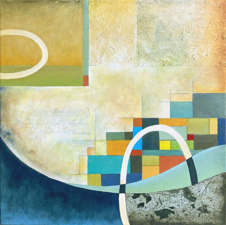
“Integral Flow” 12” x 12” acrylic, papers, pencil on canvas

“Integral Flow” 12” x 12” acrylic, papers, pencil on canvas

Once I had completed “Ennobled", I shifted my focus to the newly started 6th painting in the Portals of Joy series, titled “Integral Flow.” The experience of painting this one was nothing like the last one. The process flowed easily from beginning to end. Of course, I chose a color palette I was comfortable with from the start. And maybe that attributed to the feeling of lightness that surrounded the painting process.

I experienced joy as I created both of these two paintings but that experience was so very different… neither better than the other. And I am grateful for the wonderful diversity of both.

You may be interested in a recent post: New Series: Portals of Joy

New Series: Portals of Joy

“Scatter Joy” 12” x 12” acrylic, papers, pencil on canvas

“Scatter Joy” 12” x 12” acrylic, papers, pencil on canvas

After filling many sketchbook pages with circles and grids, I finally admitted that my artwork was moving in a new direction. I needed to explore the use of geometric shapes and to get back to spending most of my time working on canvas. First I had to let go of my attachment to the Transcriptions series and allow a new creative flow to take shape. Once I explored the symbolism of this new focus, I was able to assign meaning to the paintings I would be creating and move forward with a new series. At the same time, joy had become more and more of a major influence in my life. This is how the Portals of Joy series came into being.

“Hooked on a Feeling” 12” x 12” acrylic, papers, pencil on canvas

“Hooked on a Feeling” 12” x 12” acrylic, papers, pencil on canvas

This series is a reaction to the year we have been experiencing and the times we now live in. These paintings are created in joy, with a focus on joy, and with the intention of putting more joy out into a world at a time when it’s needed. The paintings each have a quote about Joy embedded into the background of the design, under the paint, present yet not readable… as JOY seems to be more often held under the surface this year, although still present in our lives. The grid of colors represents us as individuals but part of the whole. And the presence of the circular shape represents the wholeness, oneness, and unity that we all share, beyond the illusion of what we are seeing in the outside world.

“Uplifted” 12” x 12” acrylic, papers, pencil on canvas

“Uplifted” 12” x 12” acrylic, papers, pencil on canvas

“Ennobled” 12” x 12” acrylic, papers, pencil on canvas

“Ennobled” 12” x 12” acrylic, papers, pencil on canvas

“Third Story” 12” x 12” acrylic, papers, pencil on canvas

“Third Story” 12” x 12” acrylic, papers, pencil on canvas

“Integral Flow” 12” x 12” acrylic, papers, pencil on canvas

“Integral Flow” 12” x 12” acrylic, papers, pencil on canvas

The Portals of Joy paintings will be available here at the Website on December 5th. Prints and products of this series are currently available at Pixels.com

You may be interested in a recent post… Joy: a Morning Practice
and for more on these paintings… A Process Story

2020 Reframed

“2020 Reframed" 24" x 24" Acrylic, cloth, papers, strings, and threads on canvas.

“2020 Reframed” has been accepted into the MAH’s upcoming exhibit.

Exhibit: In These Uncertain Times
at the Santa Cruz Museum of Art and History (MAH)
beginning on January 15, 2021

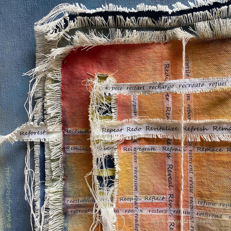
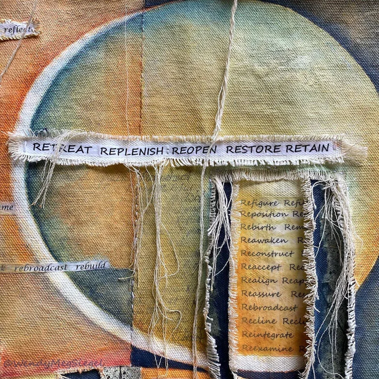
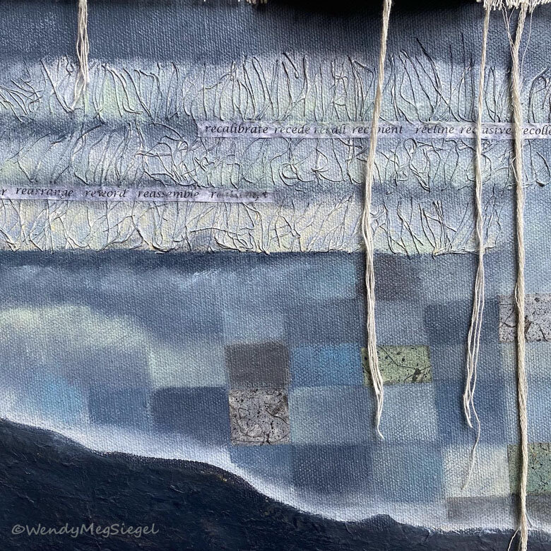
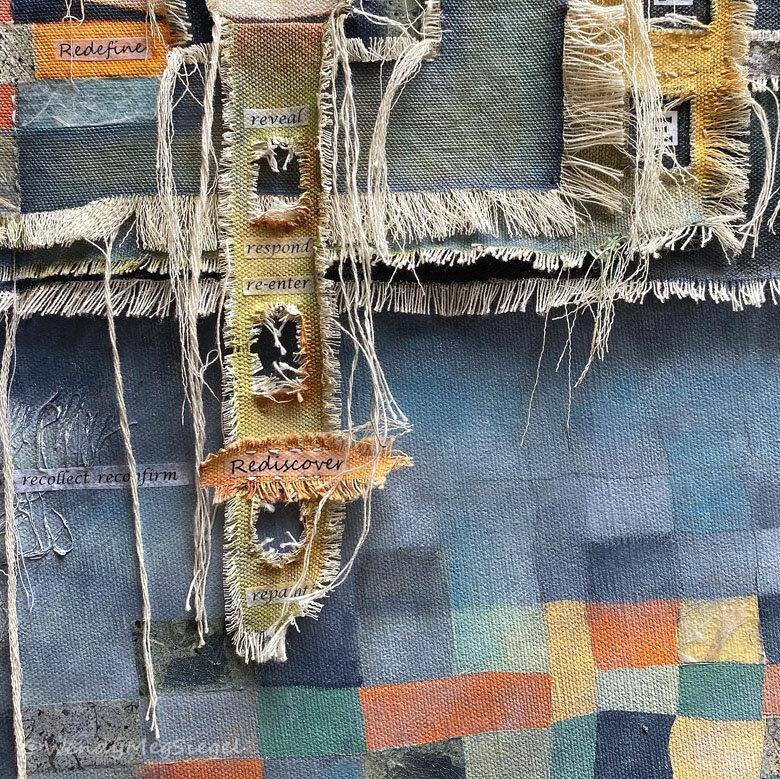
2020 is no ordinary year… filled with layers of challenges and unlike any we’ve experienced. Early in the year, I started to notice an unusual presence of RE-WORDS showing up in my life and in the world around me. I am referring to an abundance of words beginning with the letters RE. (Retreat, rediscover, recreate, reinvent, recover...) It’s been a year in which we’ve all had reasons to RE-vise our plans, RE-assess our priorities, and RE-define our lives. We have waited for businesses to RE-open and wondered if and when we might RE-turn to “normal.”

"2020 Reframed” in process

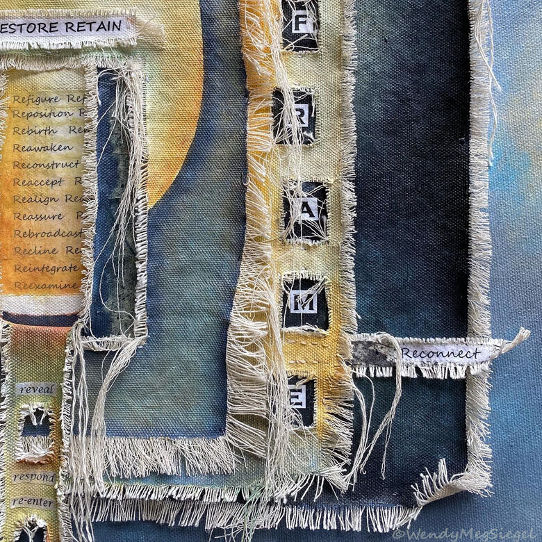
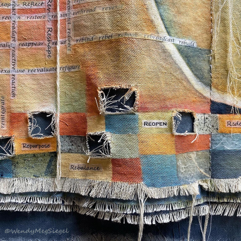
Back in May, I created a RE-WORDS concertina sketchbook, an eight page book built to highlight these words. Once it was completed, I felt a strong need to continue working on this project, but in a larger format. So I printed my collection of re-words in different fonts and sizes and began constructing a painting. “2020 Reframed” is loaded with words appearing on layers and strips of raw canvas. The prepared layers have been stitched together and are sewn onto a 24” x 24” stretched canvas. The loose threads and textures further represent a time in which our personal and societal threads have been laid bare.

Here are some details of the completed painting:

AND not long after the completion of this painting, a new word emerged: RE-population. It’s used when fire evacuees are returned to their homes. (Luckier than many, we are very thankful to have had a home to return to.)

A Week with Circles

Circle_painting_WMS_Emerge.jpg
Circle_painting_WMS_Within.jpg

During the past week I completed 6 small circle paintings. I wanted these to serve as a continuation of the themes and images that developed during the sketchbook challenge. As I began this series, my focus was on the concepts of wholeness and unity represented by the circular form.

I split the sheet into six segments for six individual paintings to be completed one a day. The color palette was to stay pretty much the same throughout. Although it was unplanned, their proximity to one another had an influence on the adjacent pieces.

Circle_painting_WMS_Unity.jpg
Circle_painting_WMS_Retro.jpg

I want to continue this exploration on paper before shifting to canvas.

Circle_painting_WMS_Trio.jpg
Circle_painting_WMS_Coherence.jpg

Hearts in the Art

“Love Sound” 6” x 6” mixed media on canvas. (Available through the Hearts for the Arts fundraiser.)

“Love Sound” 6” x 6” mixed media on canvas. (Available through the Hearts for the Arts fundraiser.)

“Love Sound” in process.

“Love Sound” in process.

As young children, we are introduced to the shape of the heart. It is recognized throughout the world as a symbol for love. I’m not normally one who paints hearts or adds the heart shape in my artwork. But… somehow, in the past couple of months I have produced two paintings with cloth hearts sewn into the design. Now that Valentine’s Day is only days away, I thought I would share them here.

Both paintings are part of the series of Ancient Wisdom Minis, designed around a quote from Kabir that includes a heart reference. (Kabir was a 15th century poet and mystic.) The canvases in the series are small (6” x 6”) acrylic paintings featuring words of wisdom from the past. The first step in the process is to cut, fray, and prepare the raw canvas that will create texture and form the focal point for the painting.

“Lift the Veil” 6” x 6” mixed media on canvas. SOLD

“Lift the Veil” 6” x 6” mixed media on canvas. SOLD

“Love Sound” is currently part of the Hearts for the Arts fundraiser being held at Artisans Gallery, in downtown Santa Cruz (details below). It displays the following quote: “The flute of the infinite is played without ceasing, and it’s sound is love.” ~Kabir.

“Lift the Veil” features these words: “Lift the veil that obscures the heart, and there you will find what you are looking for.” ~Kabir

heartsfor-arts.png

The 2020 Hearts for the Arts fundraiser benefits the Santa Cruz Arts Council’s arts education programs (SPECTRA and Mariposa Arts). The donated works are currently on display at Artisans as part of a silent auction for the first 13 days in February (bidding begins on February 1st and closes on February 13th).

For those in the area: The auction will be part of the First Friday Art Tour on February 7th and the Arts Council will host an Artists’ Reception from 3-5 on Sunday, February 9th.

I plan to be there on Sunday. Maybe I’ll see you there!!

Street Scenes

Blue_Wall_painting_collection.jpg

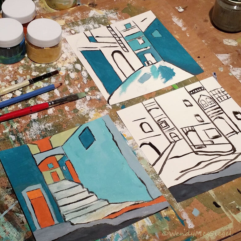
As I reflect on this year’s art explorations, one of the experiences that stands out is the group of paintings completed at the very end of the 100 Day Project. To close out the project, I played with a series of Street Scenes, painted in a new way, with a very blue color palette.

"Street Scene" 6" x 6" acrylic and color pencils on paper.

"Street Scene" 6" x 6" acrylic and color pencils on paper.

It was the painting I posted on the 82nd day of the project that inspired me to create this little mini series. Using black paint, I had made some quick lines and marks to start it off… but then I had absolutely no idea how it was going to develop. Totally by accident, I stumbled upon an image of the Moroccan village of Chefchaouen. The lines in the photo were unbelievably close to the lines of the undeveloped painting sitting before me! And I loved the idea of having fun with that color palette… blues and orange!

Three Street Scenes at different stages of development

Three Street Scenes at different stages of development

So, during the last nine days of the project, my focus was on painting more images inspired by the blue walled streets of Chefchaouen.

These works took me down a path I never would have traveled if I had continued art-making as usual, without the months of exploration. I'm thrilled to have given myself the opportunity to take this intermission, to explore new ideas, and create works on paper. So curious to see how these experiences "color" the work I do moving forward.

At the time, I wondered if I would end up painting more Street Scenes at some point, larger in size and on canvas. During my recent trip to France, I took photos of street views wherever I went, just in case I one day decided to create similarly focused paintings. Of course, they would inspire a different color palette. I don’t have any plans to do so at this time but the creative door is always open.

Wisdom of Kabir

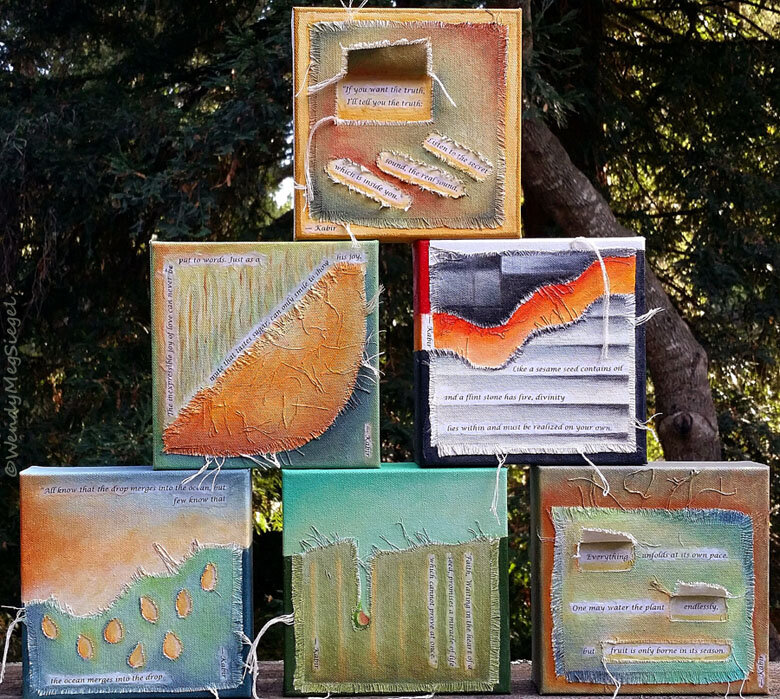
A couple of weeks ago, I began a new mini series as part of a seven day Instagram art challenge established by the wonderful, Tara Leaver. I decided to use the week to step back into playing with canvas after a half year intermission of just creating works on paper. After considering a few other project ideas, I chose to paint 6” x 6” acrylic paintings, first prepared with cut and frayed canvas cloth, and each one featuring a short quote from the 15th century mystic and poet, Kabir.

The process combines the Ancient Wisdom and text of the Transcriptions series along with the use of cloth in the Canvas on Canvas paintings.

The prepared canvases before they are painted.

The prepared canvases before they are painted.

This project was perfect to get me back into my flow again and reconnect with stretched and raw canvas… by cutting it, shaping it, and stringifying it before any paint touches the surface. (In case you’re wondering, stringifying is not a word but it perfectly describes what I love to do with raw canvas.)

“The Release” 6” x 6” mixed media on canvas

“The Release” 6” x 6” mixed media on canvas

Since creating the six small canvases for the mini challenge, I’ve completed two more and I'm confident I'll be adding to the Ancient Wisdom series with larger pieces. I’ve also begun to collect the words of those who have touched the hearts of generations through the centuries… Rumi and Hafez to name a couple. I'm looking forward to seeing what unfolds from here.

The Ancient Wisdom Minis can be found at the Canvas on Canvas gallery on my website.

And… Check Out the art created by the other participants of the 7 day mini series. Tara Leaver did a great job of posting the work on her blog.

The 100 Day Project

“Explorations” series in process.

“Explorations” series in process.

I was just beginning a new mini-series when I learned of the 100 Day Project on Instagram and it peeked my interest. As I write this, it is day 24 and I had committed to creating 25 pieces in the “Explorations” series to get me started. For the “Explorations” paintings, I’m using magazine images to inspire a daily exercise on pieces of 6” x 6” canvas paper.

My focus for the 100 days: I absolutely love to paint on canvas, raw or primed, stretched or unstretched. So, since this project is designed to take me out of my comfort zone, instead, I will be creating (mostly) small works on PAPER. I intend to play with paint, some collage, pastels, pencils, and any other materials or process I can have fun with.

Explorations_mini_painting_row1.jpg

I see the time spent on this project as an intermission between the work I've done in the past and what I will create in the future.

Explorations_mini_painting_row2.jpg

I'm curious to see how far I will go in this. One hundred days takes us to JULY! I don't know if I'll complete the full 100 days, but for now it’s my daily focus, allowing me to stretch my creative muscles.

Explorations_mini_painting_row3.jpg

The project came up for me at the perfect time… just as I was taking a break from producing paintings on canvas and instead finding and exploring various ways to develop and grow as an artist. It ties into my current need to play, experiment, and try new things.

Note: The artwork shown above is a selection of 9 pieces from the “Explorations” series. And at this time, I know I will be creating ten additional minis as part of that collection. Posts for the 100 day project and “Explorations” can be found and followed on Instagram and on my Facebook artist page.

Breath and Beyond

“Breath and Beyond” 12" x 12" acrylic, cloth, threads, and paper on canvas.

“Breath and Beyond” was the first painting I worked on and completed after returning from packing up my parent’s home. (We were getting it ready for sale.) Although I returned with several new projects in mind, I decided to get busy with the raw canvas I had prepared before leaving. My first goal was to create a thread filled environment in which to paint.

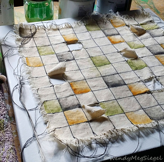
“Breath and Beyond” in process.

“Breath and Beyond” in process.

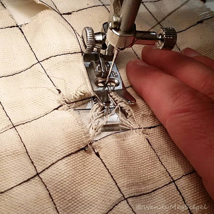
I began by sewing lines of stitches in something of a checkerboard pattern, leaving loose threads at the ends of each line. I had already cut five squares into the cloth before the trip.

“Breath and Beyond” didn’t develop as I had originally envisioned. So, I let go, allowing the process to lead me, and I was able to enjoy every step along the way.

I kept adding color, then some text, and then more color. The background canvas became a deep brownish mauve to peek through the openings in the cloth.

The text in the painting is the mantra, So Hum, meaning: "I Am That." It is used in meditation as one focuses on their breath.

“Breath and Beyond” in process.

“Breath and Beyond” in process.

I always have a title in mind by the time a painting is complete… but not this time. The painting had journeyed so far from the original idea and I felt like I was just along for the ride, not knowing where we were going. I had to brainstorm ideas for a name.

When the title, “Breath and Beyond” came to mind, I knew it was right. I could see how the painted cloth had become a tapestry OR a tapestry of life. I had chosen a mantra that represents the breath OR breath of life. And the cutouts had become windows to the beyond.

Breath and Beyond is available for purchase, here.

“Breath and Beyond” in process. Sewing the painted cloth to the back canvas.

“Breath and Beyond” in process. Sewing the painted cloth to the back canvas.

Small Bites

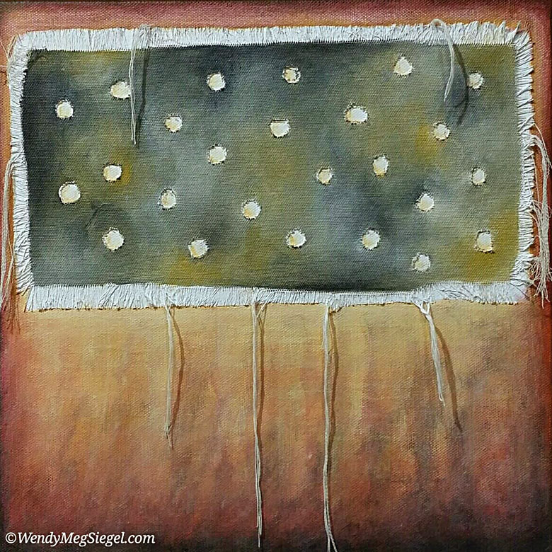
Small Bites 12" x 12" acrylic and cloth on canvas.

Small Bites 12" x 12" acrylic and cloth on canvas.

A dream became the inspiration for Small Bites… an original painting that is now part of my Canvas on Canvas series. First I prepared the piece of raw canvas by fraying the edges and cutting out holes in the cloth. I attached it to the stretched canvas and then it was time to take out the acrylics and brushes and choose some colors.

Small Bites in process. Choosing the color palette.

Small Bites in process. Choosing the color palette.

Choosing the color palette:

I only had a vague idea of the colors I would use. So, I began with one of my favorite starter color palettes: yellow oxide, titanium white, and Payne’s grey. (Oh, but since I have very little Payne's grey around, I'm using ivory black.) I love the way these colors mix together!

Now I had to choose the rest of the colors. I have a small collection of color cards that I’ve created and add to from time to time. I find it very helpful in choosing a color palette when I don't have one immediately in mind. I went back and forth on different color ideas for this one.

It took me a while to get comfortable with the reds I had chosen, but I really like the idea of stretching my “color comfort zone.” And by the time I was finished, I had grown much more comfortable with the reds in this color palette. (0f course, I did soften the intensity of the color, somewhat.)

Small Bites is available for purchase, here.

Painting with the Kaddish

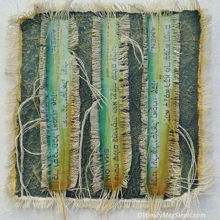
"Kaddish 1" 12" x 12" acrylic, paper, string, and cloth on canvas.

"Kaddish 1" 12" x 12" acrylic, paper, string, and cloth on canvas.

With the recent loss of my parents, it seemed the perfect time to create a painting with a focus on the Kaddish, a Hebrew prayer often referred to as the Mourner’s Kaddish. I have always loved the flow of rhythmic sounds as these Hebrew words are recited aloud, particularly in a group. There is a cadence to these sounds that becomes a shared journey.

Text strips prepared for “Kaddish 1”

Text strips prepared for “Kaddish 1”

First, I spent a day preparing strips of canvas cloth for the lines of text I would be using in the painting. I probably created enough strips to produce multiple paintings. Hence, the name Kaddish 1.

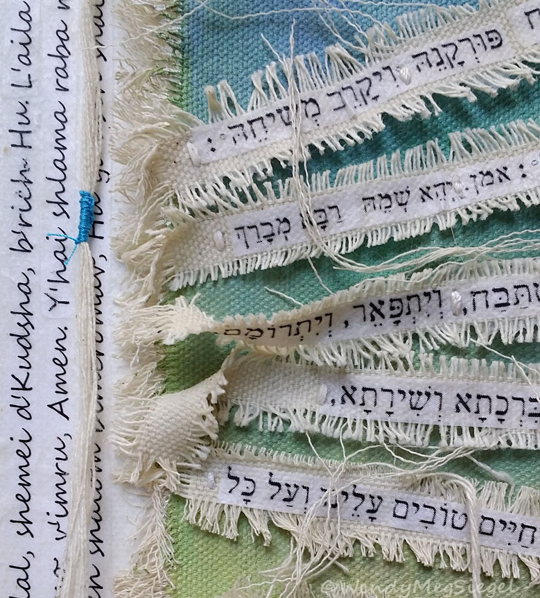
Detail of “Kaddish 1”

Detail of “Kaddish 1”

While working on Kaddish 1, I never had a clear vision of where it was going. The painting seemed to keep showing me what my next steps were in it’s development. It took some time before the design layout for the text strips became clear. You might be able to see how the strips are not laying flat, but each one has an area which is raised up (image down below). And… I have to say, I became quite jazzed at the idea of adding the three lines of text to the left side of the background canvas, after placing single rows of text on the other three sides.

For now, this painting will remain with me and won’t be available for purchase. But I do plan to do more like it.

Detail of “Kaddish 1”

Detail of “Kaddish 1”

Twas Brillig

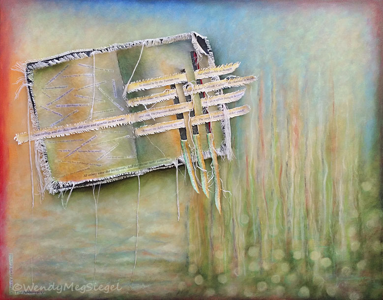
“Twas Brillig” 24” x 30” Acrylic, canvas cloth, and paper on canvas.

“Twas Brillig” 24” x 30” Acrylic, canvas cloth, and paper on canvas.

Detail image of “Twas Brillig”

Detail image of “Twas Brillig”

Painting brings me joy. I love my time in the studio and the relationship I develop with each of my creations… but once and awhile I create something that significantly increases the joy. “Twas Brillig” did just that. It turned up the “Joy Meter” and I was in no rush to complete it. I found myself savoring every moment I spent playing with this canvas.

For years I have wanted to create a painting with a focus on Lewis Carroll’s, Jabberwocky. I have loved it since high school. In fact, in one of my art classes back then, we had to illustrate a children’s book for a painting and drawing class. I chose to illustrate The Jabberwocky. (Thank you, Mr. Foo)

Closeup of the attached book on “Twas Brillig”

Closeup of the attached book on “Twas Brillig”

I so enjoyed playing with the text of the poem as I incorporated Carroll’s unique and wonderful words into the constructed cloth book. I took my time developing the background of the stretched canvas that became the setting for the “book.” This one gave me an opportunity to explore with color and structure.

Detail image of “Twas Brillig”

Detail image of “Twas Brillig”

My original goal was to, in some way, allow the words of Lewis Carroll to spill from the book, as if the boundaries of the books could not contain it. I would love to do more canvases like this one. Playing with text as it pours from the painting surface. These are the types of images that keep coming up in my mind, calling to be created.
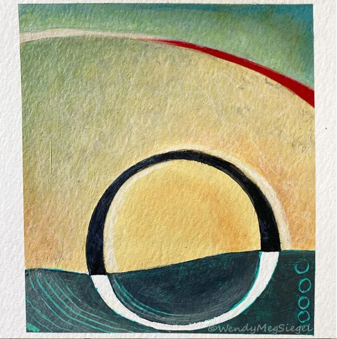
I enjoyed every moment I spent on this painting. And I can’t help but wonder if this one may be something of a bridge between the work that has come before and the artwork I will be creating, moving forward. I definitely approached the painting process differently than I might have in the past… and that had been my goal.

Here are the words of the first and last stanzas of the poem for those of you unfamiliar with Jabberwocky, by Lewis Carroll and for those who would enjoy a reread:

’Twas brillig, and the slithy toves
Did gyre and gimble in the wabe:
All mimsy were the borogoves,
And the mome raths outgrabe.”

Twas Brillig is available for purchase, here.

Above and Below

“Above and Below” 12” x 12” Acrylic and canvas cloth on canvas.

“Above and Below” 12” x 12” Acrylic and canvas cloth on canvas.

After a couple of months away from the studio, it was so good to hold a paintbrush in my hands again. To get back into the flow, I chose to play with a work in progress I had begun awhile ago. It had been waiting for months for me to return to complete it. Back then, I had cut a piece of raw canvas cloth and gessoed it onto a 12" x 12" canvas. The cutouts were inspired by Georgia O'Keefe's clouds.

This was the perfect project for my return and I so enjoyed the process. I didn’t care how it turned out. All that mattered was the delight of being busy in the studio.

“Above and Below” in progress.

“Above and Below” in progress.

Originally, I had a whole different color palette in mind when I first attached the cut cloth to the canvas, months ago. But now is a different time and place. So, the process of painting this one took me on an unexpected path. I like watching as paintings unfold before me. And I'm delighted to be back in process.

Inspired by: Georgia O'Keefe's, "Sky Above the Clouds"

Above and Below is available for purchase, here.

Autumn Shade

“Autumn Shade” 12” x 12” Acrylic and canvas cloth on canvas.

“Autumn Shade” 12” x 12” Acrylic and canvas cloth on canvas.

Autumn_mixed_media_painting_in_process.jpg

Autumn Shade was the first painting I completed after ten days of playing with crayons. So, I can’t help but wonder how much that experience influenced my choice of colors for this canvas. Of course, I was also craving the fall colors as I sat in my studio, in October, looking out on the evergreen trees that surround our home. I’m loving these colors.

This is another one of the Canvas on Canvas series that I have so enjoyed painting. Unlike the Transcriptions series and the Text-tures, there is minimal construction and no sewing of elements onto canvas. It provides me with pure painting joy.

Autumn Shade is available for purchase, here.

Crayon Challenge

Crayon_Challenge_art.jpg

Last month I had an opportunity to participate in an Instagram crayon challenge. I joined for the last ten days of a 30 day challenge. For the first 20 days, I watched as other artists were having fun with these sticks of color. I wanted in! I was going to be away from home and crayons were the ideal media to take on the road. Not only was I going to see what I would create with crayons, I decided to use this challenge to explore asemic writing as well.

While away, I awoke early each morning to play with my collection of colors and each night I drew until I finally turned off the lights. It was a joy to return to my roots as an artist, to the first art medium I used as a child.

I knew I was getting more comfortable with the crayons and making it my own when I added the book element to the drawing.

I knew I was getting more comfortable with the crayons and making it my own when I added the book element to the drawing.

It’s been about a month since I completed my last posted crayon drawing. The experience has definitely left its mark on me and the crayons have found a place in my heart.

I have tried to return to the studio and continue working as before, but I know the crayon challenge has changed me. I feel as if I am just setting off on a rerouted track and about to travel the path of a new adventure.

Meanwhile, the crayons keep calling to me. I think I will have to make a commitment to continue playing with them as a gift to my inner kid as she becomes one with my playful adult.

Asemic_crayon_art.jpg
Asemic_crayon_art_circle.jpg

Asemic Writing

I loved creating this work on paper! When I produced this piece a couple of months ago, I felt like I had stumbled onto a wonderfully exciting creative adventure. I guess I was finally giving myself permission to explore an idea I’ve been wanting to play with for quite awhile. The idea was to include non-specific text in my artwork… to write without words. I’ve wanted to create the illusion of text without any specific meaning and then I learned it had a name: asemic writing.

According to Wikipedia and referenced on a number of other sites, asemic means "having no specific semantic content", or "without the smallest unit of meaning."

The use of asemic writing seems to be a natural progression for me after incorporating ancient languages into my paintings over the past few years. This is my first creative experience with asemic writing but definitively not my last. I am looking forward to exploring this further.

“We are all Connected” 6” x 9” mixed media on paper

“We are all Connected” 6” x 9” mixed media on paper

Mini Series

“Shivaya”

“Shivaya”

“Peace Kaddish”

“Peace Kaddish”

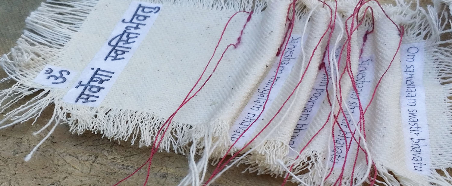
It all started when I was thinking of doing a “30 Paintings in 30 Days” challenge. The idea of creating a series of 6” x 6” paintings on canvas intrigued me. Back in April, I had done a small group of works on paper in that size.

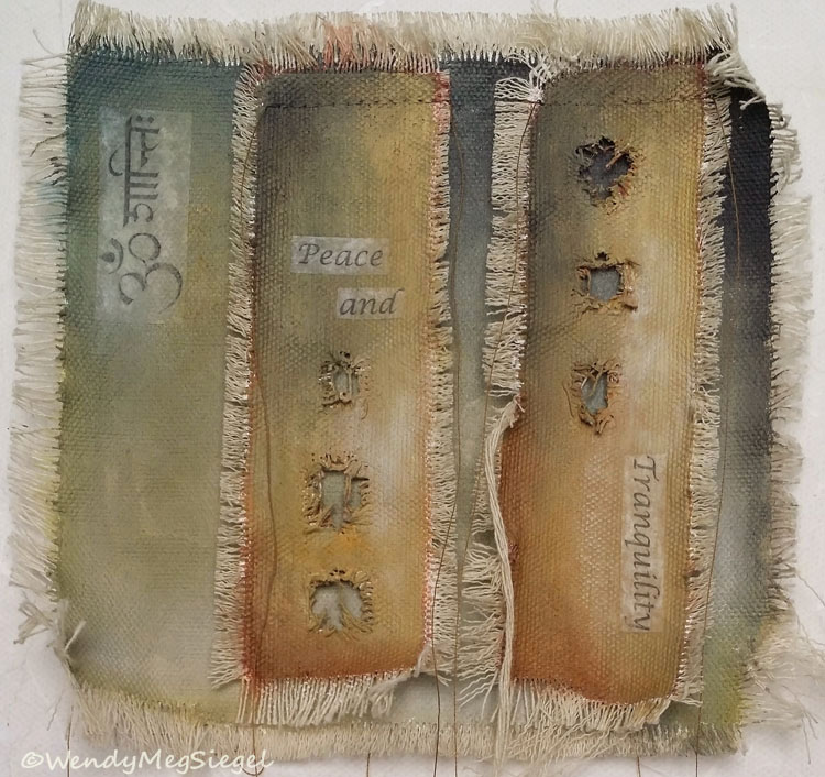
So, when considering the challenge, I decided to begin a series of Transcriptions Minis. Although small, they require many of the same steps in the process as those of the Transcriptions series. I quickly learned that unless this was my only focus, it was unlikely to produce 30 in 30 days.

“Peace and Tranquility”

“Peace and Tranquility”

As I write this post today, the next issue of the Shared Easel Newsletter is almost complete and the seventh small painting is about to be finished.

I may not be doing too many more of these, but I do get a twinkle in my eye at the idea of returning to this size for future projects. For now, I have loved using the sewing machine to attach the pieces of canvas cloth. I adore the stringiness I can create with the hanging threads. And I am surprised that I have enjoyed working this small.

“May All Be at Peace”

“May All Be at Peace”

My goal for the month was to redesign the Shared Easel newsletter and produce the first issue using MailChimp. But first I had to learn how to work within MailChimp to create a newsletter template. Ugh!! I had just spent the summer learning how to create a website with Squarespace. Now I had to tackle another new platform.

I guess you can see why the idea of creating 30 Mini’s had to slip away. What I did realize was that these small paintings were perfect for balancing studio time with newsletter development.

Work in Progress

Work in Progress