The 100 Day Project

“Explorations” series in process.

“Explorations” series in process.

I was just beginning a new mini-series when I learned of the 100 Day Project on Instagram and it peeked my interest. As I write this, it is day 24 and I had committed to creating 25 pieces in the “Explorations” series to get me started. For the “Explorations” paintings, I’m using magazine images to inspire a daily exercise on pieces of 6” x 6” canvas paper.

My focus for the 100 days: I absolutely love to paint on canvas, raw or primed, stretched or unstretched. So, since this project is designed to take me out of my comfort zone, instead, I will be creating (mostly) small works on PAPER. I intend to play with paint, some collage, pastels, pencils, and any other materials or process I can have fun with.

Explorations_mini_painting_row1.jpg

I see the time spent on this project as an intermission between the work I've done in the past and what I will create in the future.

Explorations_mini_painting_row2.jpg

I'm curious to see how far I will go in this. One hundred days takes us to JULY! I don't know if I'll complete the full 100 days, but for now it’s my daily focus, allowing me to stretch my creative muscles.

Explorations_mini_painting_row3.jpg

The project came up for me at the perfect time… just as I was taking a break from producing paintings on canvas and instead finding and exploring various ways to develop and grow as an artist. It ties into my current need to play, experiment, and try new things.

Note: The artwork shown above is a selection of 9 pieces from the “Explorations” series. And at this time, I know I will be creating ten additional minis as part of that collection. Posts for the 100 day project and “Explorations” can be found and followed on Instagram and on my Facebook artist page.

The Explorations Mini Series

“Explorations” mini series, paintings on paper.

“Explorations” mini series, paintings on paper.

I began a new mini series on the first day of April… the “Explorations series.” This group of small paintings was inspired because of spring cleaning. After spending time clearing out my parent’s home, I came back to my house and immediately began to clean out drawers and cabinets.

One cabinet was filled with magazines. I don’t think I’ve ever thrown out a magazine. There must have been somewhere around 70 magazines in that cabinet. Many of them had been cut up and used when my daughter was younger, for collages and creative projects. It was time for that pile to go. They’ve been taking up space for years. But first I wanted to flip through the pages of each magazine… and as I did so, I was inspired to create one more project with them.

“Explorations” series in process.

“Explorations” series in process.

I began pulling out any page with an image or part of an image that I found interesting. The magazines went into the recycle bin and I ended up with a fairly good sized pile of pages to consider using in some way. Before I knew it, I had glued one or more pieces of an image onto eight 6” x 6” sheets of canvas paper. They were ready to be painted.

The Goal: for the attached magazine image to inspire and challenge me to create something new each day. The “Explorations” give me an opportunity to shake things up, experience a personal art exercise. and see where it might lead.

“Explorations #12” 6” x 6” mixed media on paper.

“Explorations #12” 6” x 6” mixed media on paper.

My original intention was to complete ten of these and then decide if I wanted to continue. But the day I posted the first one, I decided to join the 100 day project on Instagram and made a commitment to create 25 in the series.

Posts for the 100 day project and the “Explorations” can be found and followed on Instagram and on my Facebook artist page.

In the next blog-post, I will share more about the project.

On Letting Go

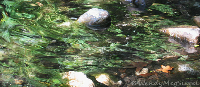
Letting_go_green_reflection2.jpg

The concept of letting go has been in the forefront of my mind since this year began. Letting go is a process. It is likely to take place in stages rather than all at once. And it is up to us to allow or invite the process to work through us.

Doors to new experiences and discoveries can more easily open when we let go of expectations, ideas, or the replaying of our personal stories. We may find that our way of being in the world has been altered. Letting go is our way of releasing tightly held beliefs, goals, or even the hands of a loved one.

Years ago, I often visualized the letting go process based on my experiences sitting and meditating at the Esopus Creek, in Mt. Tremper, New York. I would envision myself laying in a narrow stream, holding onto a rock or log, trying to fight against the current. In doing so, all of the leaves, twigs, and debris being carried down the stream would build up against me. This added to my struggle as the increase in weight intensified my burden. But… By no longer fighting the current, I could float down the stream with ease, experiencing greater peace.

My Recent Experiences:
This year seems to be a year of letting go. On January 1st, I let go of my Dad, and the ability to ever hold his hand again. On January 8th, I watched my Mom slip away from life to join him. Throughout January, I let go of my goals and plans for the month to allow myself to begin the grieving process and be whatever I needed to be in each moment. In February, I let go of my creative expectations and embraced new ideas, changes in color palette, and a new approach to my paintings. In March, I had to let go of my parent’s belongings as I went through their home, packing their stuff to giveaway or donate. I shipped a small selection from New York to California and had to dig deep to let go when some of those things arrived damaged or destroyed.

All of this letting go, seems to be leading to new perspectives. And I must say, I am ready for these changes. I feel like I’m one of those spring blossoms about to burst open.

Now, in April, I have let go of the artwork I am accustomed to in order to create new artistic experiences. I plan to share much of this creative journey as it unfolds. In fact, since April 1st, I’ve been posting pieces of a new mini series on Instagram and on my Facebook artist page. I will also be sharing more, right here, in future blog-posts.

Managing Grief after Losing My Parents:
I am letting go of their physical presence in my life, but the rich memories, love, and growth that I experienced throughout the years remain very much alive within me. That’s what I will carry with me in each moment moving forward. I know that I am who I am because of their presence in my life.

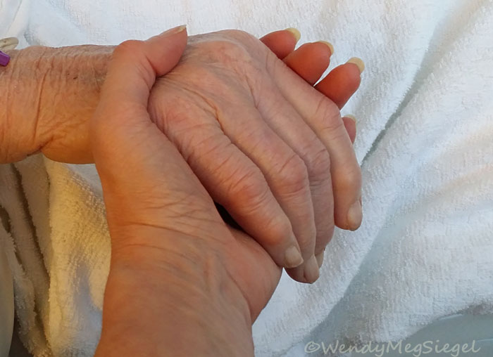
Holding my Mom’s hand just hours before she died.

Holding my Mom’s hand just hours before she died.

So each day, I let go of holding onto them. I let go of any need to perpetuate the grief, instead allowing the ebb and flow of emotions as they arise. (They definitely arise!) And regardless of any grief I will experience over the coming weeks, months, and years, I want to let them be fully present in whatever realm their spirits now reside. In turn, I allow myself to move into a new world of experiences, with curiosity in how the empty spaces created by their vacancy will be filled. I openly invite the changes that continue to take place.

Breath and Beyond

“Breath and Beyond” 12" x 12" acrylic, cloth, threads, and paper on canvas.

“Breath and Beyond” was the first painting I worked on and completed after returning from packing up my parent’s home. (We were getting it ready for sale.) Although I returned with several new projects in mind, I decided to get busy with the raw canvas I had prepared before leaving. My first goal was to create a thread filled environment in which to paint.

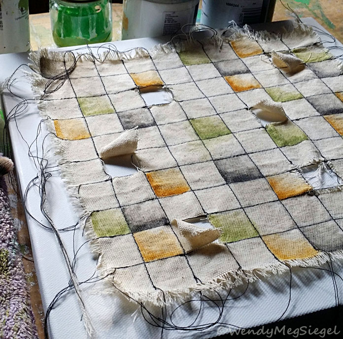
“Breath and Beyond” in process.

“Breath and Beyond” in process.

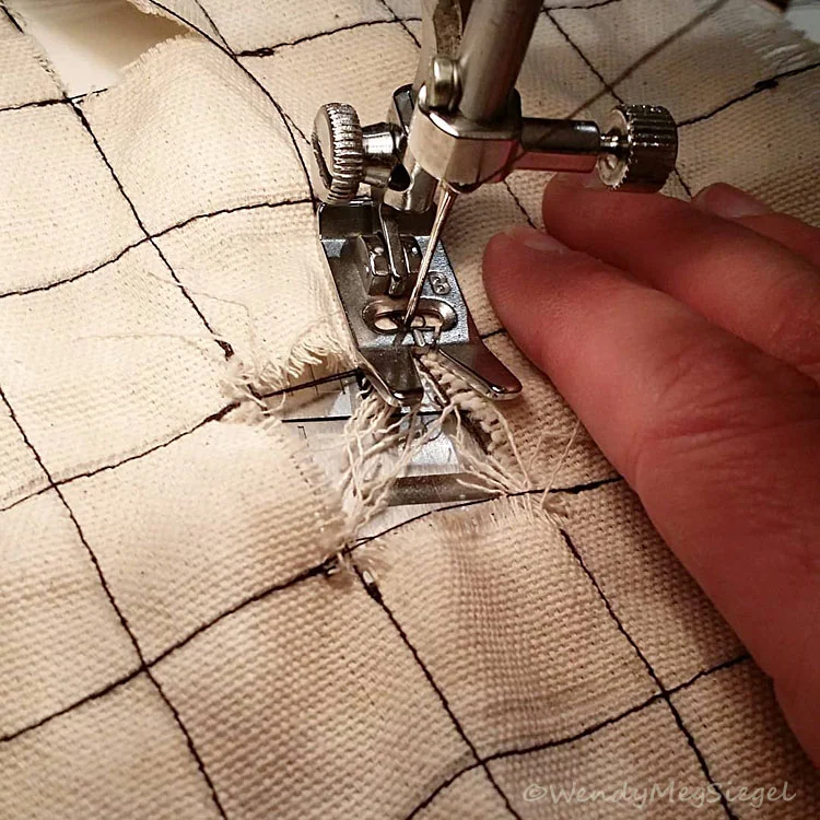
I began by sewing lines of stitches in something of a checkerboard pattern, leaving loose threads at the ends of each line. I had already cut five squares into the cloth before the trip.

“Breath and Beyond” didn’t develop as I had originally envisioned. So, I let go, allowing the process to lead me, and I was able to enjoy every step along the way.

I kept adding color, then some text, and then more color. The background canvas became a deep brownish mauve to peek through the openings in the cloth.

The text in the painting is the mantra, So Hum, meaning: "I Am That." It is used in meditation as one focuses on their breath.

“Breath and Beyond” in process.

“Breath and Beyond” in process.

I always have a title in mind by the time a painting is complete… but not this time. The painting had journeyed so far from the original idea and I felt like I was just along for the ride, not knowing where we were going. I had to brainstorm ideas for a name.

When the title, “Breath and Beyond” came to mind, I knew it was right. I could see how the painted cloth had become a tapestry OR a tapestry of life. I had chosen a mantra that represents the breath OR breath of life. And the cutouts had become windows to the beyond.

Breath and Beyond is available for purchase, here.

“Breath and Beyond” in process. Sewing the painted cloth to the back canvas.

“Breath and Beyond” in process. Sewing the painted cloth to the back canvas.

Small Bites

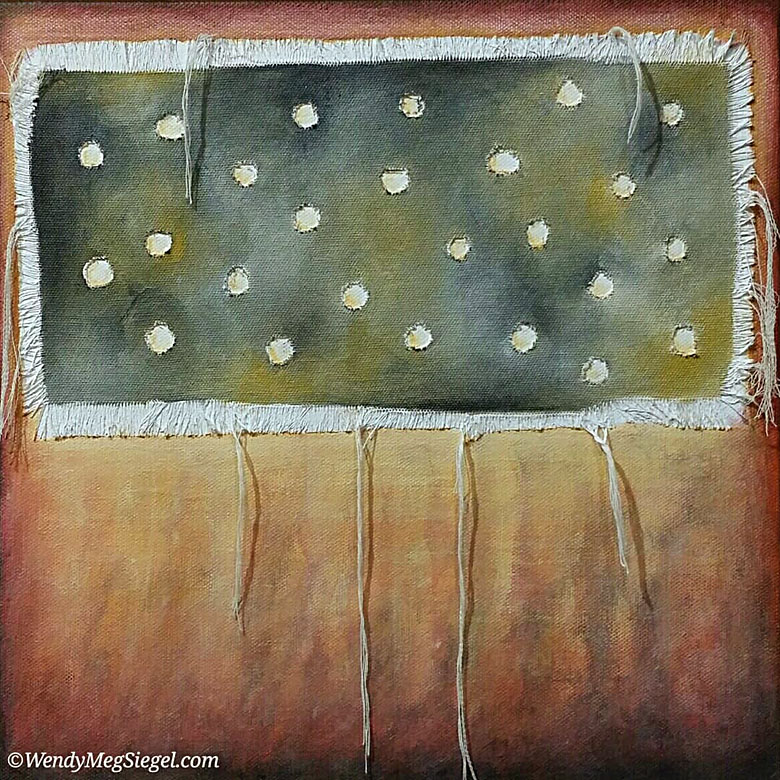
Small Bites 12" x 12" acrylic and cloth on canvas.

Small Bites 12" x 12" acrylic and cloth on canvas.

A dream became the inspiration for Small Bites… an original painting that is now part of my Canvas on Canvas series. First I prepared the piece of raw canvas by fraying the edges and cutting out holes in the cloth. I attached it to the stretched canvas and then it was time to take out the acrylics and brushes and choose some colors.

Small Bites in process. Choosing the color palette.

Small Bites in process. Choosing the color palette.

Choosing the color palette:

I only had a vague idea of the colors I would use. So, I began with one of my favorite starter color palettes: yellow oxide, titanium white, and Payne’s grey. (Oh, but since I have very little Payne's grey around, I'm using ivory black.) I love the way these colors mix together!

Now I had to choose the rest of the colors. I have a small collection of color cards that I’ve created and add to from time to time. I find it very helpful in choosing a color palette when I don't have one immediately in mind. I went back and forth on different color ideas for this one.

It took me a while to get comfortable with the reds I had chosen, but I really like the idea of stretching my “color comfort zone.” And by the time I was finished, I had grown much more comfortable with the reds in this color palette. (0f course, I did soften the intensity of the color, somewhat.)

Small Bites is available for purchase, here.

Painting with the Kaddish

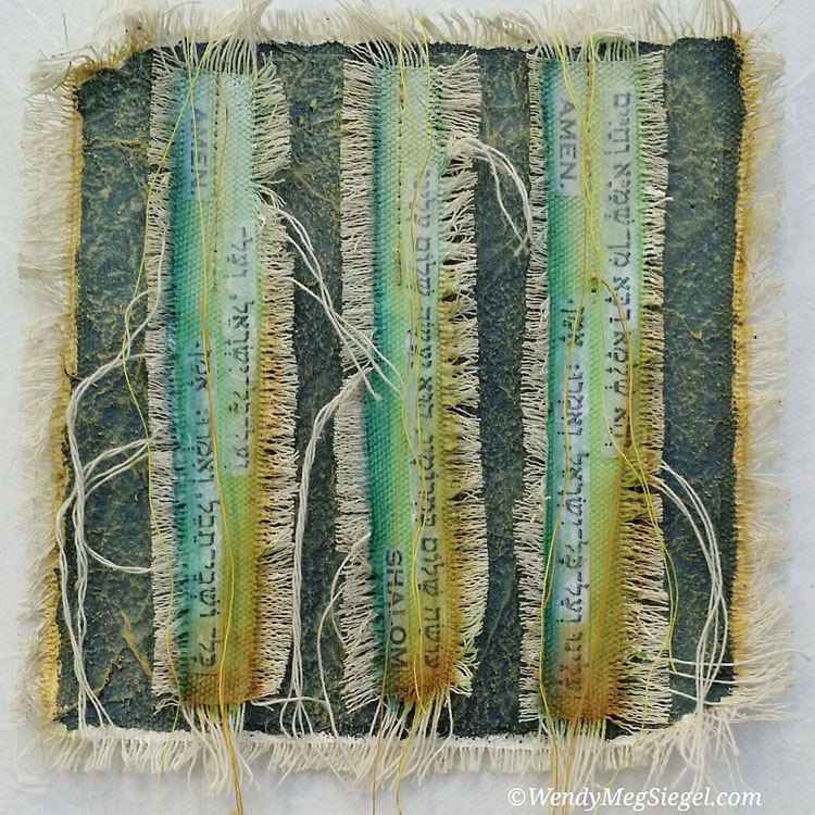
"Kaddish 1" 12" x 12" acrylic, paper, string, and cloth on canvas.

"Kaddish 1" 12" x 12" acrylic, paper, string, and cloth on canvas.

With the recent loss of my parents, it seemed the perfect time to create a painting with a focus on the Kaddish, a Hebrew prayer often referred to as the Mourner’s Kaddish. I have always loved the flow of rhythmic sounds as these Hebrew words are recited aloud, particularly in a group. There is a cadence to these sounds that becomes a shared journey.

Text strips prepared for “Kaddish 1”

Text strips prepared for “Kaddish 1”

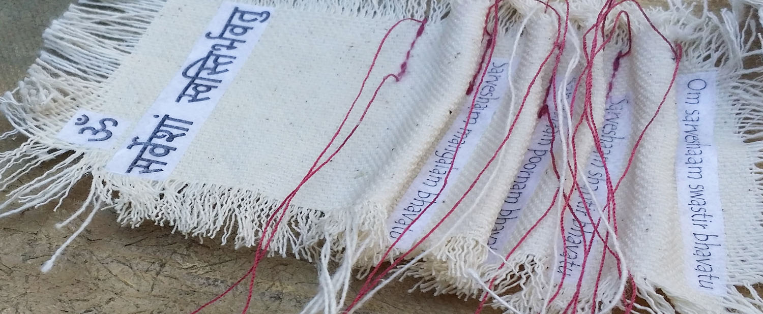
First, I spent a day preparing strips of canvas cloth for the lines of text I would be using in the painting. I probably created enough strips to produce multiple paintings. Hence, the name Kaddish 1.

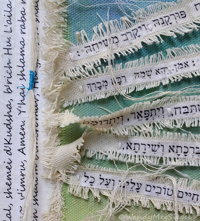
Detail of “Kaddish 1”

Detail of “Kaddish 1”

While working on Kaddish 1, I never had a clear vision of where it was going. The painting seemed to keep showing me what my next steps were in it’s development. It took some time before the design layout for the text strips became clear. You might be able to see how the strips are not laying flat, but each one has an area which is raised up (image down below). And… I have to say, I became quite jazzed at the idea of adding the three lines of text to the left side of the background canvas, after placing single rows of text on the other three sides.

For now, this painting will remain with me and won’t be available for purchase. But I do plan to do more like it.

Detail of “Kaddish 1”

Detail of “Kaddish 1”

Twas Brillig

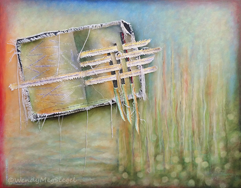
“Twas Brillig” 24” x 30” Acrylic, canvas cloth, and paper on canvas.

“Twas Brillig” 24” x 30” Acrylic, canvas cloth, and paper on canvas.

Detail image of “Twas Brillig”

Detail image of “Twas Brillig”

Painting brings me joy. I love my time in the studio and the relationship I develop with each of my creations… but once and awhile I create something that significantly increases the joy. “Twas Brillig” did just that. It turned up the “Joy Meter” and I was in no rush to complete it. I found myself savoring every moment I spent playing with this canvas.

For years I have wanted to create a painting with a focus on Lewis Carroll’s, Jabberwocky. I have loved it since high school. In fact, in one of my art classes back then, we had to illustrate a children’s book for a painting and drawing class. I chose to illustrate The Jabberwocky. (Thank you, Mr. Foo)

Closeup of the attached book on “Twas Brillig”

Closeup of the attached book on “Twas Brillig”

I so enjoyed playing with the text of the poem as I incorporated Carroll’s unique and wonderful words into the constructed cloth book. I took my time developing the background of the stretched canvas that became the setting for the “book.” This one gave me an opportunity to explore with color and structure.

Detail image of “Twas Brillig”

Detail image of “Twas Brillig”

My original goal was to, in some way, allow the words of Lewis Carroll to spill from the book, as if the boundaries of the books could not contain it. I would love to do more canvases like this one. Playing with text as it pours from the painting surface. These are the types of images that keep coming up in my mind, calling to be created.

I enjoyed every moment I spent on this painting. And I can’t help but wonder if this one may be something of a bridge between the work that has come before and the artwork I will be creating, moving forward. I definitely approached the painting process differently than I might have in the past… and that had been my goal.

Here are the words of the first and last stanzas of the poem for those of you unfamiliar with Jabberwocky, by Lewis Carroll and for those who would enjoy a reread:

’Twas brillig, and the slithy toves
Did gyre and gimble in the wabe:
All mimsy were the borogoves,
And the mome raths outgrabe.”

Twas Brillig is available for purchase, here.

Above and Below

“Above and Below” 12” x 12” Acrylic and canvas cloth on canvas.

“Above and Below” 12” x 12” Acrylic and canvas cloth on canvas.

After a couple of months away from the studio, it was so good to hold a paintbrush in my hands again. To get back into the flow, I chose to play with a work in progress I had begun awhile ago. It had been waiting for months for me to return to complete it. Back then, I had cut a piece of raw canvas cloth and gessoed it onto a 12" x 12" canvas. The cutouts were inspired by Georgia O'Keefe's clouds.

This was the perfect project for my return and I so enjoyed the process. I didn’t care how it turned out. All that mattered was the delight of being busy in the studio.

“Above and Below” in progress.

“Above and Below” in progress.

Originally, I had a whole different color palette in mind when I first attached the cut cloth to the canvas, months ago. But now is a different time and place. So, the process of painting this one took me on an unexpected path. I like watching as paintings unfold before me. And I'm delighted to be back in process.

Inspired by: Georgia O'Keefe's, "Sky Above the Clouds"

Above and Below is available for purchase, here.

Losing Both My Parents

My parents holding hands during one of my mom’s visits to my dad’s hospital room. The wonderful hospital staff helped make sure they visited one another every day.

My parents holding hands during one of my mom’s visits to my dad’s hospital room. The wonderful hospital staff helped make sure they visited one another every day.

Two months ago today, my dad died in a hospital room, at age 94. Exactly one week later my mom took her last breath in a similar room just a few rooms away. She would have celebrated her 90th birthday a few weeks later. After 70 years of marriage, they were still choosing to do everything together.

I’m finding that in order to move on and begin to share art related posts again on this blog, I have the need to first share this loss. The experience of watching both parents slip away was powerful and the loss is life altering. I can already see changes in the way I approach my paintings and my life. In recent weeks, I’ve needed time to hibernate and step back from “life as I knew it.” I’ve been taking one step at a time and easing myself back into the world. In writing this today, it is a step forward.

Helen and Ruby on their Wedding Day, 1949

Helen and Ruby on their Wedding Day, 1949

I was so very fortunate to have both parents in my life for so many years. I so appreciate the abundance of love and support I always received from them. Their enthusiastic response, anytime we shared details of new ventures, accomplishments, possibilities, and experiences, was a continuous gift to the whole family. They made it easy and joyful to share anything and everything with them.

And how they loved each other!! I believe they lived as long as they did because of their commitment to one another. And being in their presence, you just could not help but be drawn into the vortex of love and gratitude vibrantly operating between the two of them. It’s no wonder they seemed to have fans wherever they went… and of course, they always went together.

For years, my brother and I hoped that our parents would somehow be able to leave this world at the same time or shortly after one another. We knew it would be too painful for either of them to be left behind without the other. They orchestrated their exit pretty well. They were miraculously admitted to the hospital on the very same day, for different reasons. During their final days, they were surrounded by loved ones and managed to visit one another each day. When they were able, they held hands, blew each other kisses, and continued to touch the lives of those around them.

We witnessed and experienced a whole lot in those weeks, including many precious moments. I know I will miss them deeply, but I am so glad that neither of them has to continue life without the other. Their love story continues.

What a gift it has been to have had so many years with my loving parents and to have been a witness to their love and commitment to one another!

Mom and Dad doing what they loved most - sharing a meal with their family. 2016

Mom and Dad doing what they loved most - sharing a meal with their family. 2016

Autumn Shade

“Autumn Shade” 12” x 12” Acrylic and canvas cloth on canvas.

“Autumn Shade” 12” x 12” Acrylic and canvas cloth on canvas.

Autumn_mixed_media_painting_in_process.jpg

Autumn Shade was the first painting I completed after ten days of playing with crayons. So, I can’t help but wonder how much that experience influenced my choice of colors for this canvas. Of course, I was also craving the fall colors as I sat in my studio, in October, looking out on the evergreen trees that surround our home. I’m loving these colors.

This is another one of the Canvas on Canvas series that I have so enjoyed painting. Unlike the Transcriptions series and the Text-tures, there is minimal construction and no sewing of elements onto canvas. It provides me with pure painting joy.

Autumn Shade is available for purchase, here.

Crayon Challenge

Crayon_Challenge_art.jpg

Last month I had an opportunity to participate in an Instagram crayon challenge. I joined for the last ten days of a 30 day challenge. For the first 20 days, I watched as other artists were having fun with these sticks of color. I wanted in! I was going to be away from home and crayons were the ideal media to take on the road. Not only was I going to see what I would create with crayons, I decided to use this challenge to explore asemic writing as well.

While away, I awoke early each morning to play with my collection of colors and each night I drew until I finally turned off the lights. It was a joy to return to my roots as an artist, to the first art medium I used as a child.

I knew I was getting more comfortable with the crayons and making it my own when I added the book element to the drawing.

I knew I was getting more comfortable with the crayons and making it my own when I added the book element to the drawing.

It’s been about a month since I completed my last posted crayon drawing. The experience has definitely left its mark on me and the crayons have found a place in my heart.

I have tried to return to the studio and continue working as before, but I know the crayon challenge has changed me. I feel as if I am just setting off on a rerouted track and about to travel the path of a new adventure.

Meanwhile, the crayons keep calling to me. I think I will have to make a commitment to continue playing with them as a gift to my inner kid as she becomes one with my playful adult.

Asemic_crayon_art.jpg
Asemic_crayon_art_circle.jpg

Asemic Writing

I loved creating this work on paper! When I produced this piece a couple of months ago, I felt like I had stumbled onto a wonderfully exciting creative adventure. I guess I was finally giving myself permission to explore an idea I’ve been wanting to play with for quite awhile. The idea was to include non-specific text in my artwork… to write without words. I’ve wanted to create the illusion of text without any specific meaning and then I learned it had a name: asemic writing.

According to Wikipedia and referenced on a number of other sites, asemic means "having no specific semantic content", or "without the smallest unit of meaning."

The use of asemic writing seems to be a natural progression for me after incorporating ancient languages into my paintings over the past few years. This is my first creative experience with asemic writing but definitively not my last. I am looking forward to exploring this further.

“We are all Connected” 6” x 9” mixed media on paper

“We are all Connected” 6” x 9” mixed media on paper

Changes

Establishing a new website, blog, and newsletter can be very positive. It feels like everything has a fresh new look and feel which can be quite energizing. But, there's another side to this.

Last night I spent some time at my old blog. I have been posting articles and artwork there for almost ten years. Although my experience with Blogger has had it's frustrations recently, it has been home to the Shared Easel blog and newsletter.

Finding a new home through Squarespace means letting go of the past and moving on. Even when change is good, it still has it's moments of needing to embrace the new and release the tendency to hold onto the old. This is true whether we are talking about a website or a life experience.

Changing_Leaves_cluster.jpg

Life is a series of changes... changing times, changing relationships and experiences, changes in mood, beliefs, thoughts, and dreams. We are constantly faced with new opportunities, challenges, and obstacles. 

So, as I travel the path of my fresh start, I am reflecting fondly on the past and the steps of the journey to this point. I am very excited to be where I am now. 

What changes are you making in your life?

Mini Series

“Shivaya”

“Shivaya”

“Peace Kaddish”

“Peace Kaddish”

It all started when I was thinking of doing a “30 Paintings in 30 Days” challenge. The idea of creating a series of 6” x 6” paintings on canvas intrigued me. Back in April, I had done a small group of works on paper in that size.

So, when considering the challenge, I decided to begin a series of Transcriptions Minis. Although small, they require many of the same steps in the process as those of the Transcriptions series. I quickly learned that unless this was my only focus, it was unlikely to produce 30 in 30 days.

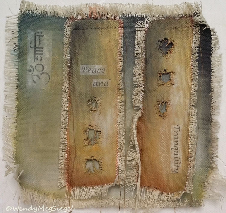
“Peace and Tranquility”

“Peace and Tranquility”

As I write this post today, the next issue of the Shared Easel Newsletter is almost complete and the seventh small painting is about to be finished.

I may not be doing too many more of these, but I do get a twinkle in my eye at the idea of returning to this size for future projects. For now, I have loved using the sewing machine to attach the pieces of canvas cloth. I adore the stringiness I can create with the hanging threads. And I am surprised that I have enjoyed working this small.

“May All Be at Peace”

“May All Be at Peace”

My goal for the month was to redesign the Shared Easel newsletter and produce the first issue using MailChimp. But first I had to learn how to work within MailChimp to create a newsletter template. Ugh!! I had just spent the summer learning how to create a website with Squarespace. Now I had to tackle another new platform.

I guess you can see why the idea of creating 30 Mini’s had to slip away. What I did realize was that these small paintings were perfect for balancing studio time with newsletter development.

Work in Progress

Work in Progress

Words of Tagore

Let_me_not_painting_detail.jpg

The words of Rabindranath Tagore are finding their way into my paintings. So far, I’ve created three mixed media paintings with a Tagore quote highlighted within the piece. I find his words wise and wonderful… and there will definitely be more of these paintings to come. In fact, I am in the process of creating the next one.

Rabindranath Tagore was an Indian poet and writer, born in Calcutta in 1861. He has a huge body of work and I’ve only recently begun to explore the beauty of his writing.

Inspired by the words of Tagore, I have begun to play with canvas, text, and paint in a textural way. Here are the three completed paintings, along with their respective quotes.

“Let Us Unite” 12” x 12” acrylic and mixed media on canvas

“Let Us Unite” 12” x 12” acrylic and mixed media on canvas

Let Us Unite

“Let us unite, not in spite of our differences, but through them. For differences can never be wiped away and life would be so much the poorer without them. Let all human races keep their own personalities, and yet come together, not in a uniformity that is dead, but in a Unity that is living.”

“One Door or Another” 12” x 12” acrylic and mixed media on canvas

“One Door or Another” 12” x 12” acrylic and mixed media on canvas

One Door or Another

“If I can’t make it through one door, I’ll go through another door - or I’ll make a door. Something terrific will come no matter how dark the present.”

Let Me Not

“Let me not pray to be sheltered from dangers but to be fearless in facing them. Let me not beg for the stilling of my pain but for the heart to conquer it. Let me not look for allies in life's battlefield but to my own strength. Let me not crave in anxious fear to be saved but hope for the patience to win my freedom. Grant me that I may not be a coward, feeling your mercy in my success alone; but let me find the grasp of your hand in my failure.”

“Let Me Not” 12” x 12” acrylic and mixed media on canvas

“Let Me Not” 12” x 12” acrylic and mixed media on canvas

Squarespace Tips

squarespace_tips.jpg

I've just recently spent a couple of months researching Web builders and then setting up my new Website through Squarespace. It can be a daunting challenge to face the 14 day trial period if you are totally new to creating a website with a web builder. So, I wanted to share some tips I've learned from my experience in working with Squarespace. Here's some of what I have learned:

To save time, plan out your website and know what you are looking for in a template.

To save time, plan out your website and know what you are looking for in a template.

  1. You can extend your 14 day trial period. Once your trial period is up, you will receive an email asking you to pay for one of their plans. At the bottom of that email, they allow you to request an extra 7 days if you are not ready to commit or not finished with designing your site.

  2. Before you begin the trial period, have a clear idea of what your priorities are for your site, the pages you will want to put in place, and how you want the site to flow. The more time you spend in advance, the better your use of time during the 14 days.

  3. Choose a template based on what you are looking for and your priorities in building a new site. Review the templates based on it's overall design, whether it has a blog option, a sidebar, gallery pages, etc. The templates have different features. Which features are most important to you?

  4. There is a lot of flexibility for adding pages and content with the Squarespace template... although some aspects are fixed to the design of the template with little possibility to altering it much. The blog design is one of those fixed elements.

  5. The Squarespace help page offers periodic webinars for getting started, lots of videos and informational pages to answer most of your questions, and an online chat with a representative. The chat process works very well, with someone available quite quickly to help you with your questions. (They cannot help you with adding code to customize your site.) They do not have a phone line.

  6. Webinar participants are given a discount code at the beginning of the webinar. It can be used when you pay for hosting. So you might as well sign up and save.

  7. Putting text in the Banner descriptions will increase the height of that Banner. Originally, I had both a title and a subtitle for several of the Banners on my site. I have since removed the text description on a number of them to create a sleeker look. (I am using the Bryant Template.)

  8. As I write this blog post now, I realize that the blog does not automatically save my work, as I've been used to in Blogger. I now have to save the draft, which closes it, and then I have to reopen it to continue writing. Awkward process!

  9. There is easy access to view the site on a mobile device. But it was so easy to miss. There's a tiny little horizontal line at the top center of your trial site. Once you hover over it, the straight line becomes a slight downward arrow. Click to reveal the icons for phone view, tablet view, and desktop view.

Opening_Mobile_views1.jpg
Opening_Mobile_views2.jpg

I chose Squarespace primarily for the clean template designs and their professional look. Here are some other things I like about using Squarespace:

  1. I love the ability to create custom URLs for every page and any image. As far as I could see, Wix created those URLs for you. I appreciate having control over the web addresses so I can keep them short and simple.

  2. You can change templates at any time. I don't know what that entails but I'm happy to be able to have that option in the future.

  3. The templates are wonderfully mobile friendly. You don't have to design for mobile devices. It is all done for you. But you could design in phone or tablet mode if you prefer.

  4. I like having the option to add code to further customize a page. I was able to find code recommendations posted by other Squarespace users. But many people will find it is easy to rely on what the template and the Squarespace tools have to offer.

I did have some frustrations in setting up my website with Squarespace. I was not thrilled with the blog design and I really didn't like the constraints of the gallery and store pages. But with a bit of code, some tech help from my husband, and some tweaks I was able to accomplish on my own, I was able to make the website exactly what I wanted it to be. 

Please let me know if you have found this helpful... and good luck setting up your new website. You may also be interested in the prior blog post on Choosing a Web Builder.

Choosing a Web Builder

Squarespace_website_trial_wendy_meg_siegel.jpg

Ten years ago I immersed myself in working with a purchased template to create a website. I wowed myself every day as I altered the code to set up galleries, links, and pages. Over the years, that site has become a dinosaur. It didn't work on mobile devices, it was clunky for adding content, and it was looking tired and old compared to the new sites out there.

So, I finally took the plunge into the world of web builders. I checked out comparison reviews of the various options. I viewed the templates offered by a wide variety of platforms. After spending much time exploring my options, I decided to simultaneously play around with a trial experience at both Squarespace and Wix.

The Squarespace Design Style Editor

The Squarespace Design Style Editor

Initially, I felt frustrated and stuck during my use of the Squarespace interface. I just didn't get it. I had journeyed into unfamiliar territory. So, I moved over to Wix and it seemed to hold my hand and show me the way. But, as I began to add images into the template and try to tweak what I wanted, it got clunky and I found myself getting frustrated.

That's when I gave Squarespace another try. I immediately felt more at home with the clean and neat design that had originally attracted me. Ten minutes with a loved one had me beginning to understand the way it worked. It didn't feel as foreign anymore. 

I chose Squarespace because of their beautifully designed templates and their polished professional interface. I had an uncomfortable learning curve but finally got my footing on this new platform. 

New Website

New_home_page_website_wendy_meg_siegel.jpg

I am thrilled to welcome you to my new Website!!

After weeks of trial and error, editing and tweaking, it is finally ready to go live. I view this site as a work in progress, with lots more to add and change in the coming weeks and months. But, today I have an updated WendyMegSiegel.com to share and it comes with a newly revitalized Shared Easel Blog, incorporated right here on my site. 

New_website_wendy_meg_siegel.jpg

With the help of the Squarespace platform, I will easily be able to add my latest artwork, update images and information, and add new pages and elements. I am very excited about the greater flexibility I will now have to alter and change anything on this site.

Although quite a bit of the old site has been left behind, I've added a few new elements: an area to feature Recent Works, an individual page for every painting with description and related artworks, and a section with images of the creative Process.

Home_page_art_process_wendy_meg_siegel.jpg

One thing I was unable to do was import the many years of posts from the Shared Easel blog at Blogspot. So I will find ways to add the link here wherever I can. (It's now a sidebar link.)

In future posts, I will be writing about some of the many changes I am making to refresh just about everything (including the Shared Easel Newsletter). It feels like a new beginning for me, my artwork, and what I have to share. So stay tuned.